SYNC: A Spatial Transcriptomics Visualization Tool
Published on
📌 Project Overview
The SYNC dashboard is an interactive visualization platform for exploring single-cell spatial transcriptomics data. It integrates dimensionality reduction (UMAP, t-SNE), cell clustering, gene expression analysis, and cell composition profiling into a single, intuitive dashboard.
Goal: Enhance interpretability of complex spatial datasets by connecting computational analysis with interactive, real-time visualization.
Implementation: Built with Plotly; available on GitHub
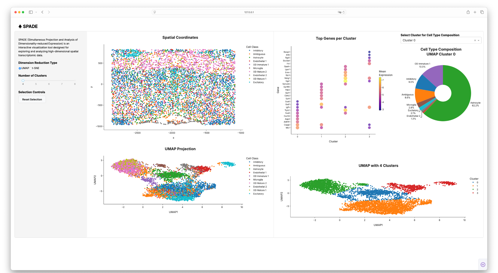
SYNC Dashboard
🔬 Key Features
1. Dashboard Structure
- Input Panel: Controls for choosing dimensionality reduction method (UMAP/t-SNE) and selecting the number of clusters.
- Spatial Plot: Displays tissue cell positions; supports selection of cells to highlight their embeddings.
- Dimensionality Reduction Panels: Displays the UMAP or t-SNE plots.
- Top Gene Expression Panel: Dot plots of top 10 genes per cluster, with dot size (prevalence) and color (expression level).
2. Interactive Visualization
- Select cells on spatial plots to highlight them in reduced-dimensional space.
- Hover interactions provide cell identity, type, and cluster info.
- Reset button restores views for iterative exploration
💡 Impact & Applications
- Simplifies exploration of tissue heterogeneity and spatial relationships at single-cell resolution.
- Supports developmental biology and disease research by integrating spatial context with transcriptional data
Future Improvements
- Gene Expression Overlay: Color-code cells by any chosen gene for quick insights
Contributors
Yeojin Kim, Aileen He, Jiaxun Li, Felix Rivera Moctezuma